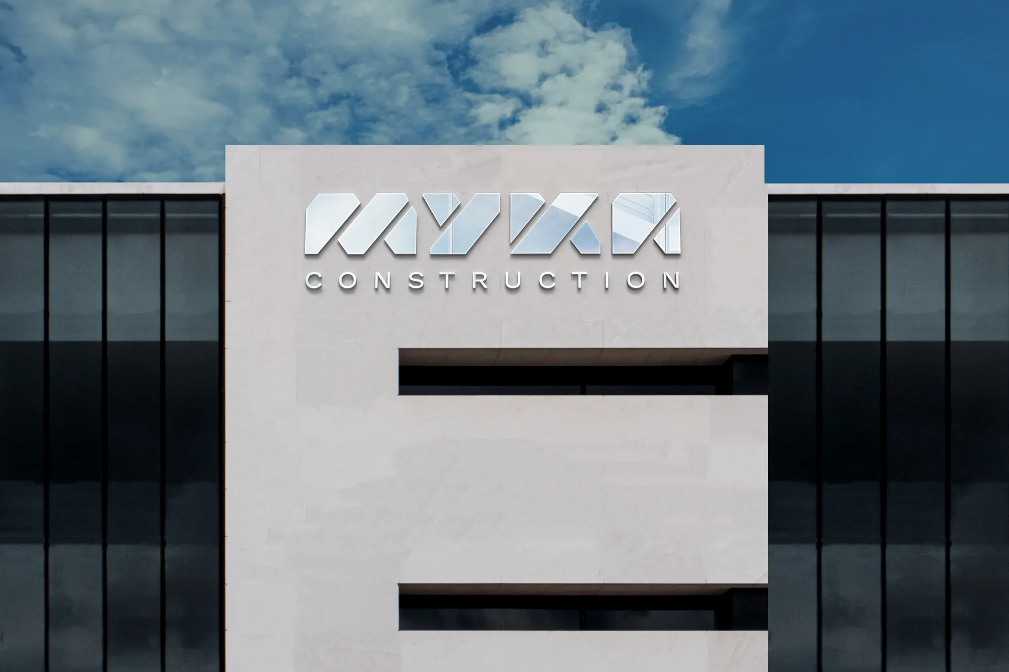
A solid brand for a construction company that does it all, from residential to commercial.
MYKA builds everything, from homes to commercial projects in Houston. It needed a brand that looked just as solid on a hard hat, on a truck and on a proposal.
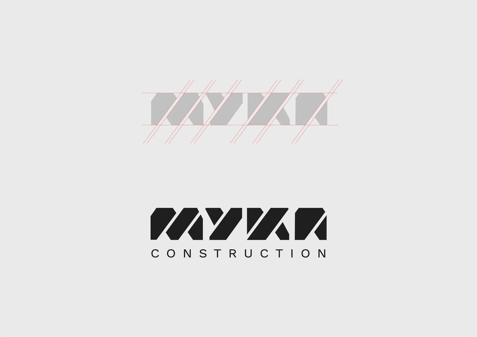
We worked in black and white on purpose: two colors that sum up all the others, like the variety of projects MYKA takes on. The symbol is built from diagonal bands that read as structure.
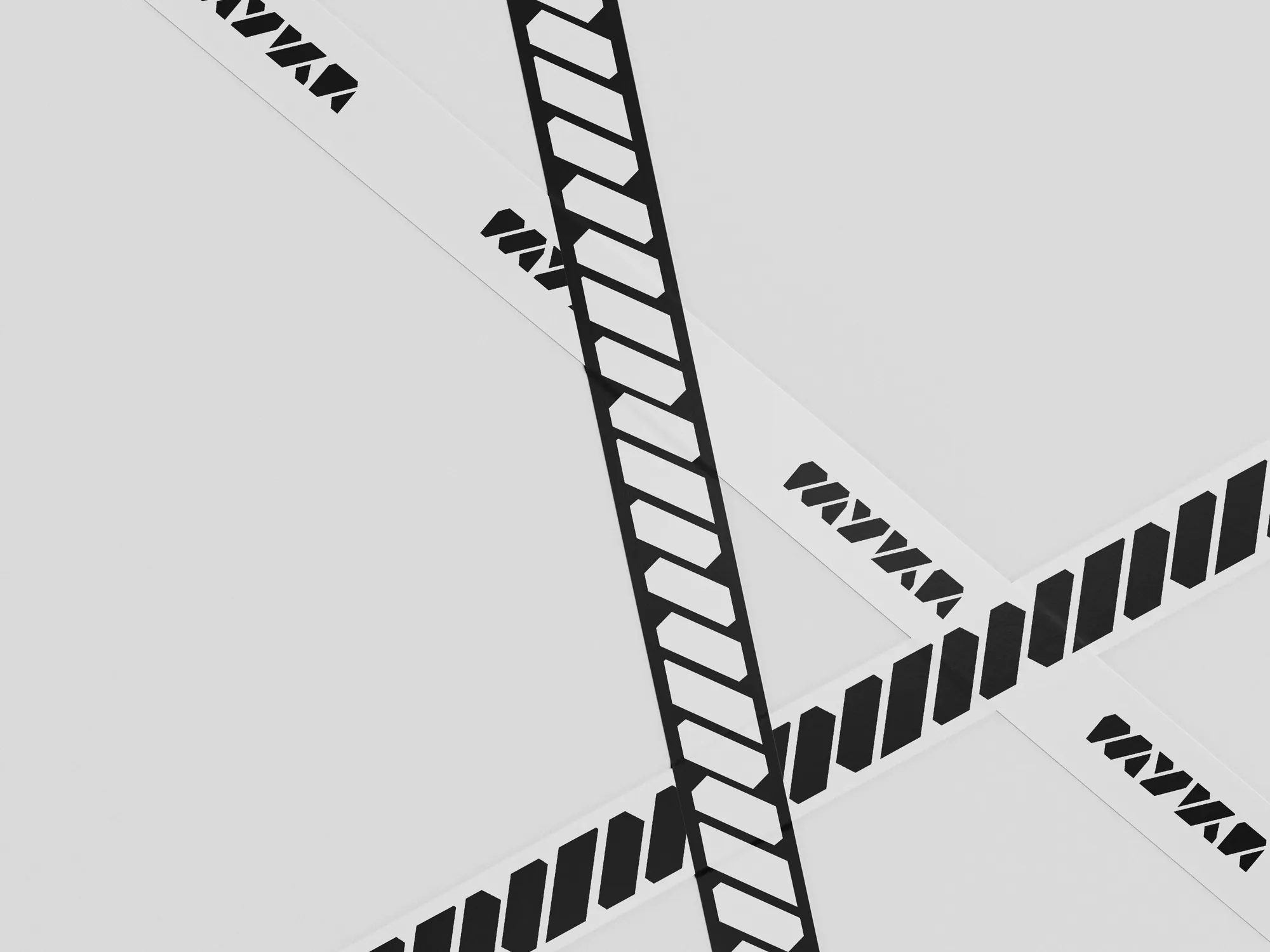
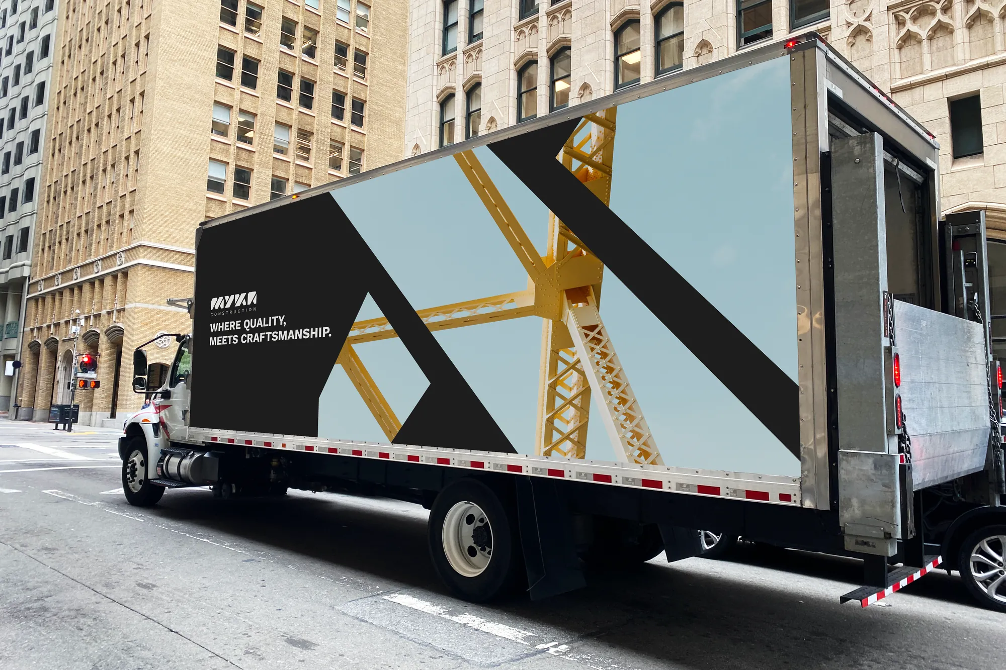
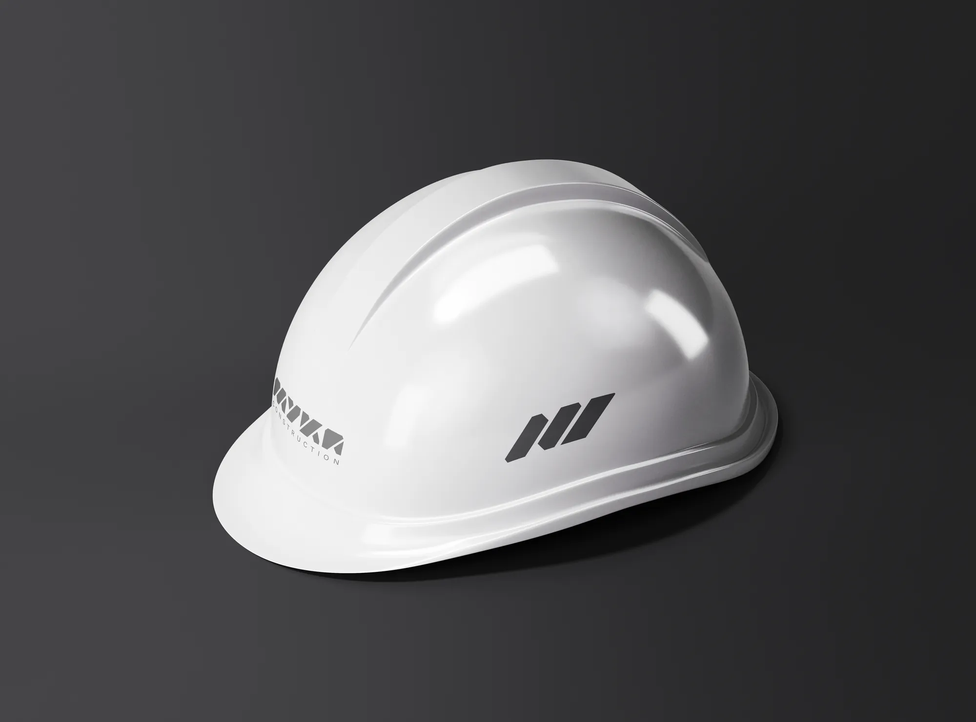
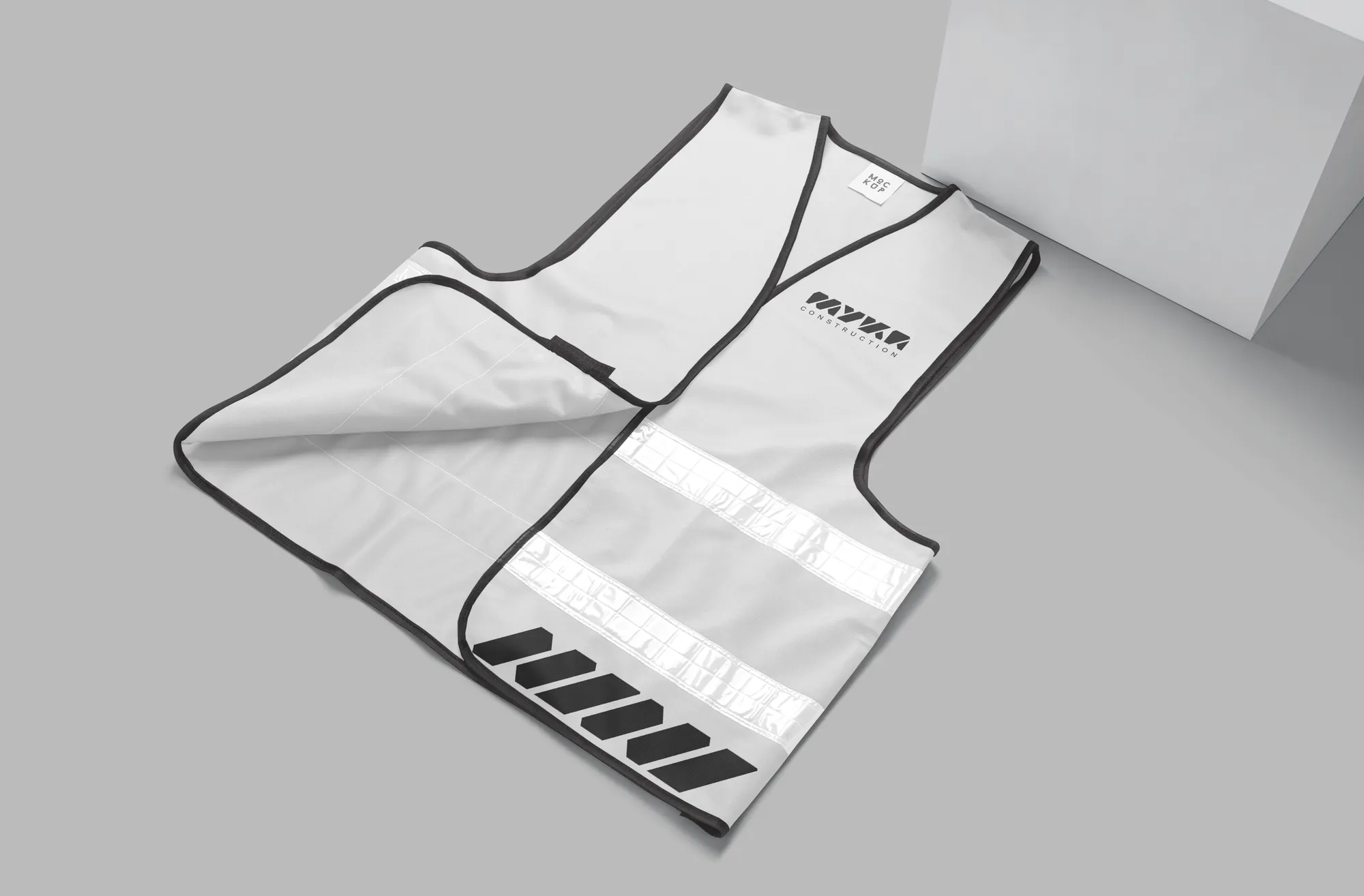
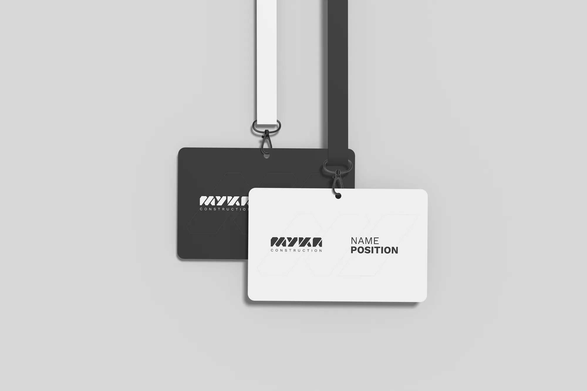
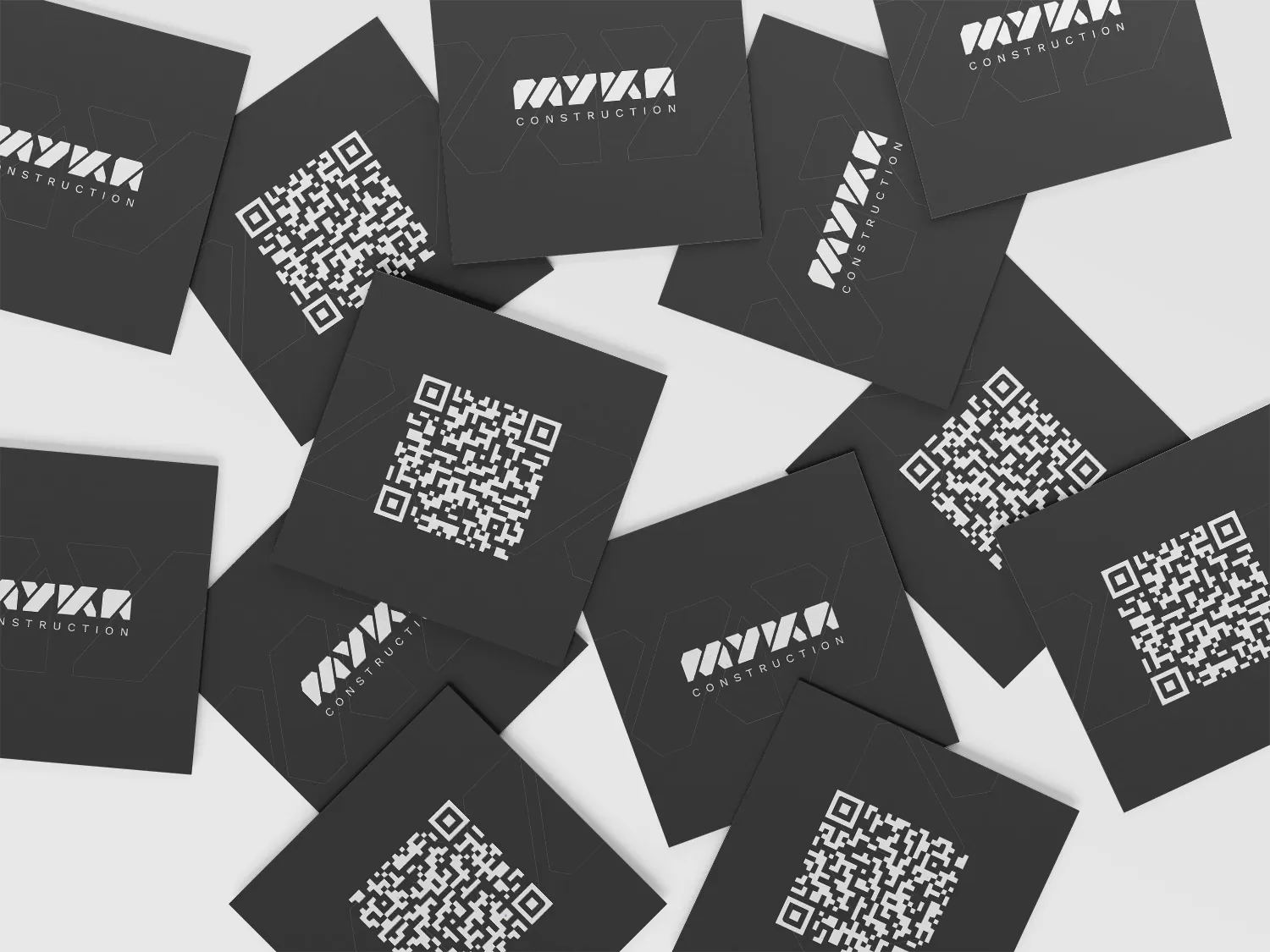
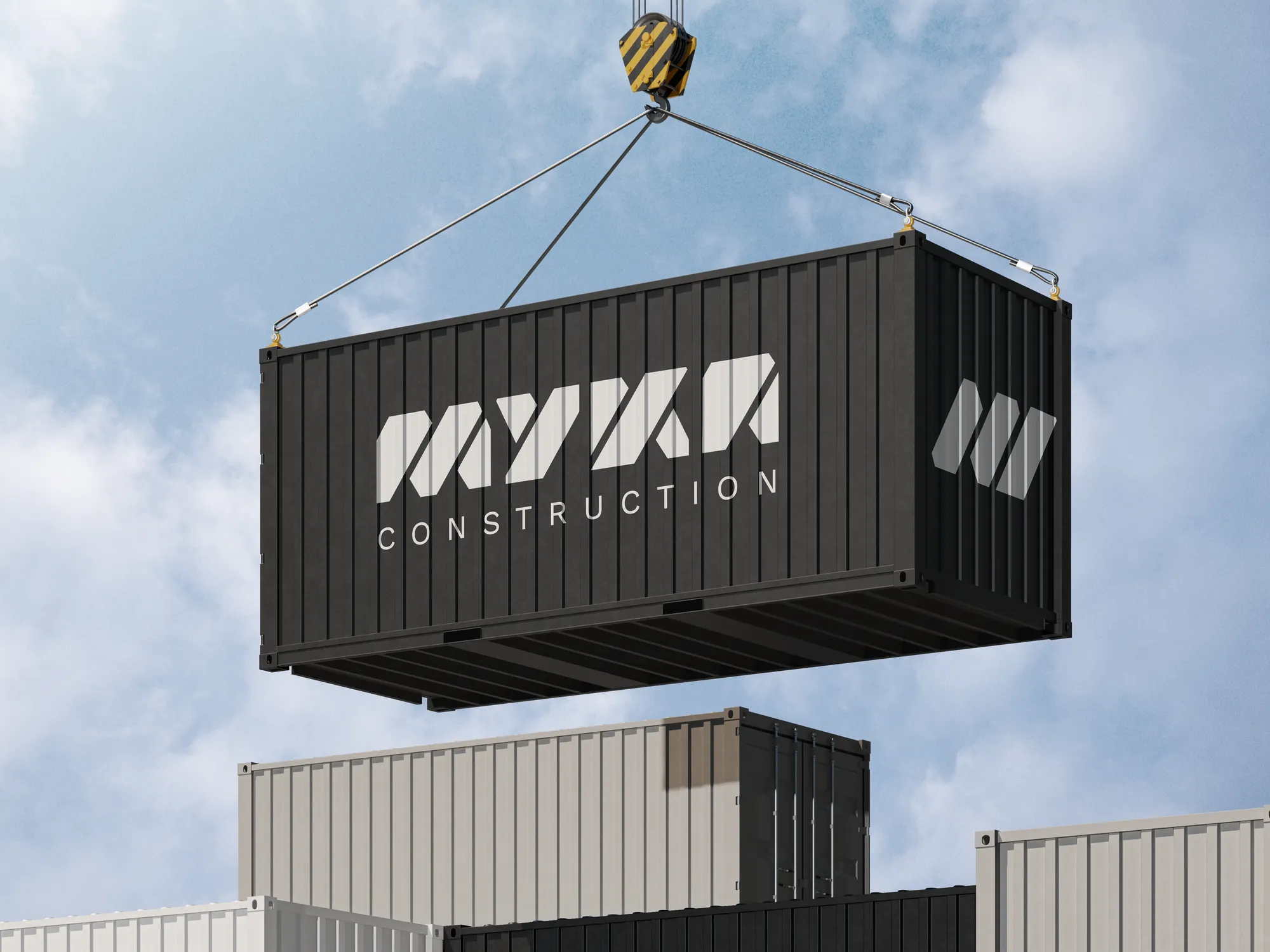
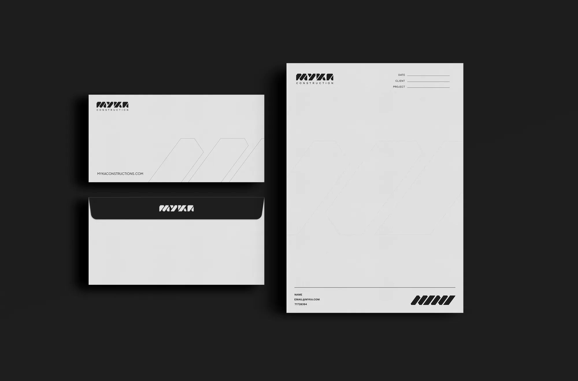
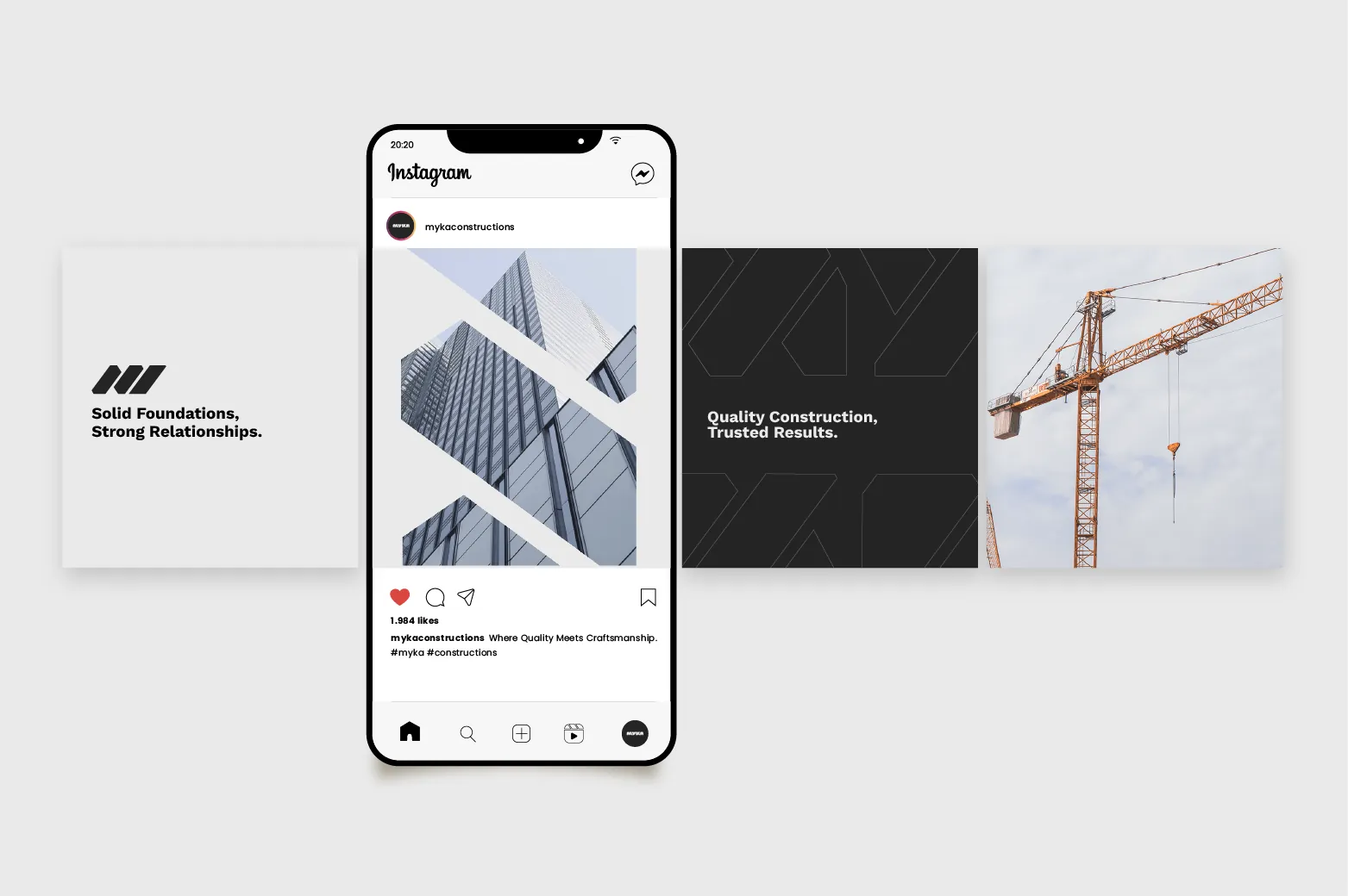
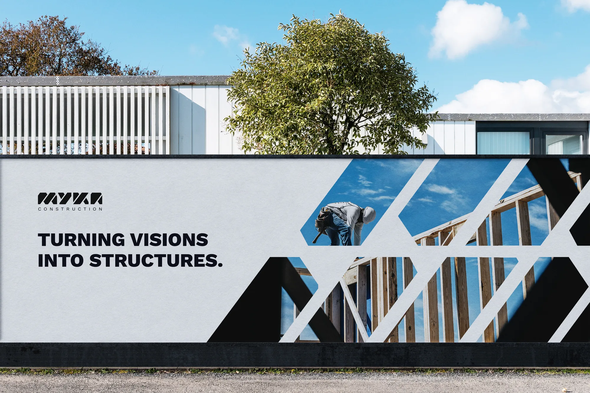
From hard hat to truck, everything reads as MYKA.
The system works on uniforms, gear, site hoardings and vehicles.
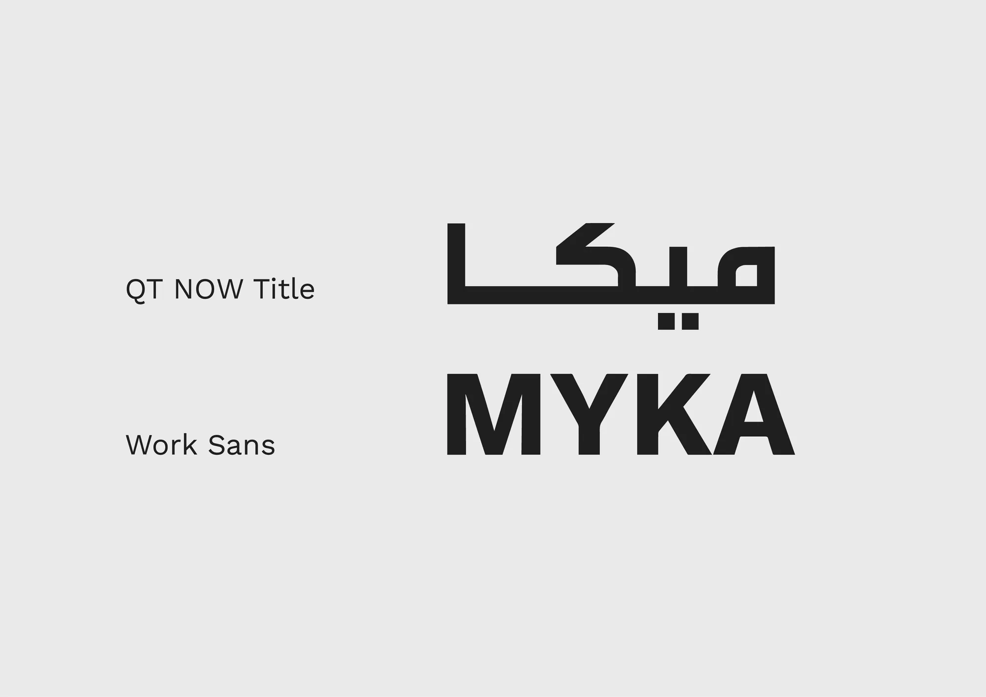
The logotype has an Arabic version built on the same structure.